Client: LuvTu
Project: Spark Dating App
Deliverable: iPhone App
Year: 2015
Challenge
Come up with a compelling mobile app for dating that goes beyond superficial swiping, but retains the tactile fun of interaction.
Research:
For a project like this, I start with a lot of research. The main questions I want to answer are:
- What apps already exist in this space?
- What’s working and what isn’t working?
- Who is the market leader?
- Where is there a need that is not being met?
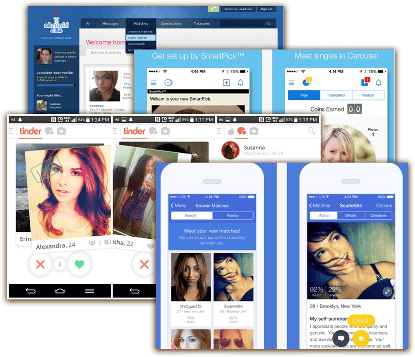
For dating apps, clearly Tinder has changed the paradigm. I found almost every dating app had moved in to the swiping interaction pattern, copying Tinder. But while this was exciting to users, it wasn’t promoting real connection. Users were swiping without any real intention or results, and there was a lot of room for improvement for people who actually wanted a real connection.
Sketching:
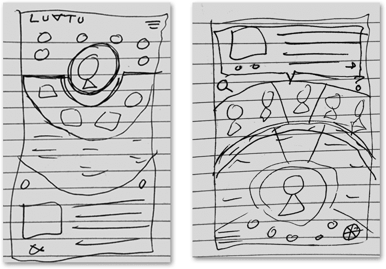
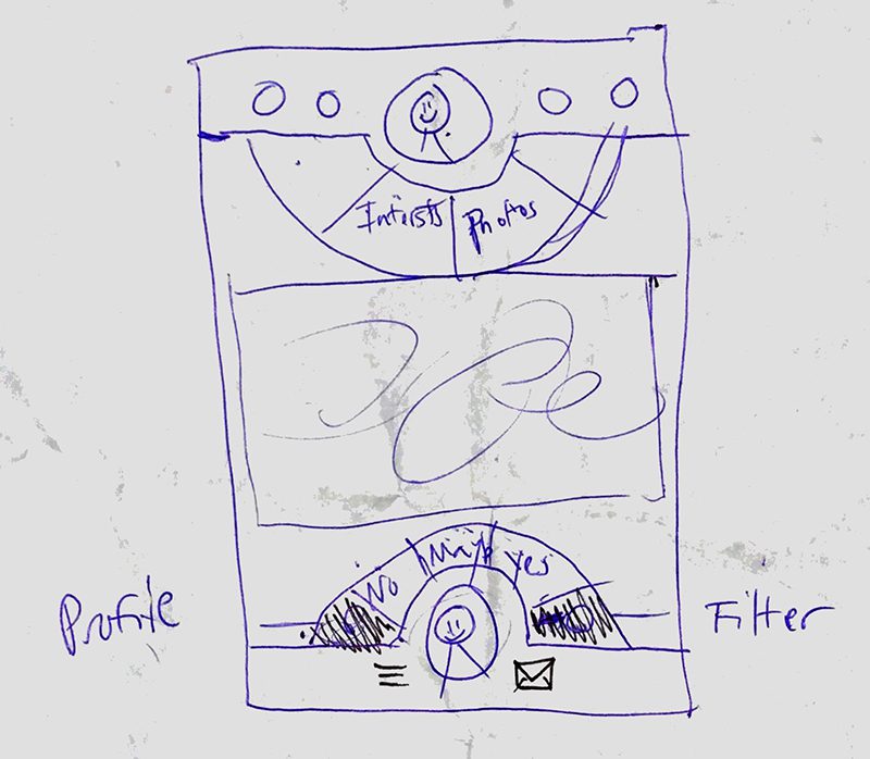
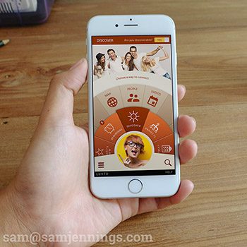
I always start sketching ideas out on paper first. This gives me a quick way get out my initial thoughts and get a sense of what is going to work or not. Through several brainstorming sessions with our team, I was able to get a sense of what we wanted in the app and how the experience should be for the user. In this case, I tried a few layout ideas moving the user around the screen, keeping them at the center of the activity and focused around a radial navigation menu. The radial navigation is an easy-to-use menu that I think is fun to spin and allows an unlimited amount of menu options. I don’t see many radial navigations out there in this space, and I thought it would be a great way to stand out.
For the dating app specifically, I wanted to have the user’s picture and their potential matches on the same screen, to promote the idea of a couple. These two people pictured together visually reinforces connection. I landed on a layout with the user’s profile pic and menu options along the bottom, and the potential match along the top with a menu of information. The middle would surface the information about the match.
Wireframes
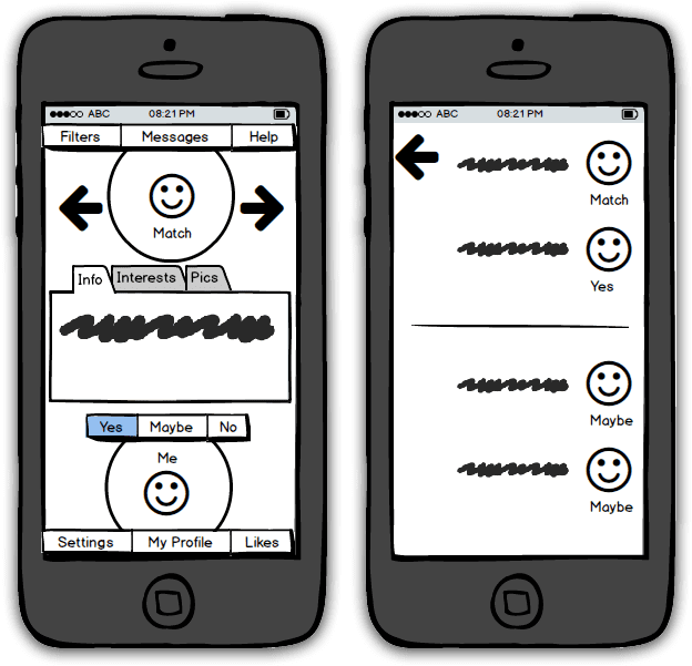
Once I had a sketch I thought worked, I took it in to the program Balsamiq to sketch out more detail and the user flow. I was able to quickly sketch out what menu information would be at the bottom and top of the main screen. Plus I created a quick click-through to show the user flow to stakeholders. Through meetings around this rough clickthrough, I could get sign off from the team to move forward.
After Balsamiq, I took the design in to Adobe Illustrator to develop the structure of the app some more and how it was going to look in the final screens. I also wanted to show the gesture motion for each interaction model to get a sense of how it would animate on a device.
First Screens:
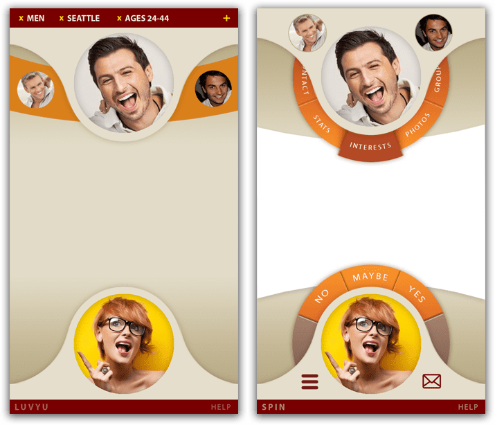
Taking the designs to the next level of itteration, I developed the designs using a combination of Adobe Illustrator and Photoshop. I wanted the app to have a very curved and smooth design with some depth. This design separated it from what has become the standard square box and flat design that is found in almost every dating app out there. The warm, citrus colors also helped it stand out, and it made the app more inviting. Dating is an intimate experience and needs to be warm and welcoming. The user needs to feel safe and comfortable, and this design brings it home.
Final Screens and Prototype
After several refinements, I settled on this design. The user swipes the potential matches across the top. Their information is presented in 3 tabs that can also be expanded to fill the entire screen. The user can choose “Yes, Maybe, No” from their menu to potentially get a match or not. “Maybe” puts them on an editable list to come back to later. Hitting the icons along the bottom moves the Settings screen over from the left, and the Matches screen over from the right.
To really drive this home, I created all the assets for the app and put them in to a prototype using InVision. This prototype illustrated the animation used throughout the app as well as the interaction gestures needed to make it come alive. The prototype was acessessed through the phone and used to demostrate the app to stakeholders as well as for potential investors.
Another key part of the overall process is the User Study. We took the prototype in to small user study groups to research the reactions and get feedback. In our research, we found that for dating apps, it is the women’s perspective that carries the most weight. The app needs to appeal to women or it won’t be successful. The feedback we got was that the users loved the interaction and inviting nature of the app. The “Maybe” function took a little getting used to, but they could see the value.
